If you follow Grognardia as closely as I do, you have no double heard about the upcoming D&D stamps the United States Postal Service will be releasing next year. It’s exciting news for RPG nerds and philatelists alike, and perhaps the biggest news for both camps since the UK’s Warhammer stamps. I’m not a stamp collector myself, but I’m old-fashioned enough to still buy several sheets a year and send actual written correspondence to people. However, like Mr. Maliszewski, I found the art selection for the stamps to be a bit lackluster and odd. The set appears to be 10 designs, and given that the 50 year anniversary of Dungeons & Dragons is the occasion commemorated by the stamps, one would expect a more retrospective scope of featured artwork. It is all, however, “Fifth Edition” art, with the notable exception of the famous Larry Elmore cover from the 1983 Mentzer Basic set.
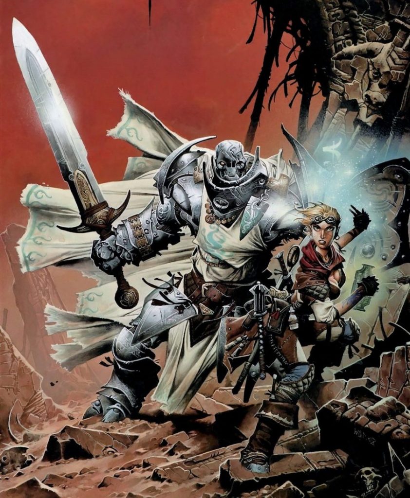
To my taste, the Fifth Edition art has been the least compelling of the brand’s illustrations, and is, frankly, the worst choice to showcase. Yes, it’s all very technically proficient, and consistent, and lavishly full-color, and all those things that Brand Identity™ loves… but, no offense to the coterie of artists involved, it’s boring. In fact, it encapsulates perfectly the banality of finely-tuned AI art, but was all made years before tools like Midjourney became household names. It doesn’t have the character of an artist’s personal hand, and is one of the big reasons I just can’t get myself interested in Fifth Edition. I’m sure there’s some gems in there that would catch my eye and captivate me, but it hasn’t jumped off the page at me during my during my occasional flip-through of the books on the game store shelf as I contemplate finally capitulating to the current flagship product.
A sensible spread of artwork for a 50 year retrospective would be to select two masterpieces from each decade of D&D’s history, or perhaps two from each primary “edition” of D&D. But, even as I consider it, the “Two Per Decade” or “Two Per Edition” distinction breaks down, given the somewhat fuzzy boundaries of the editions. Nevertheless, it seems like a nice framework, so let’s keep two stamps to be representative of Fifth Edition. Tiamat is cool, so she’s in. I’ll also accept that Lich Sorcerer guy… is that Young Acerak? I’m not really hip to who the edition’s “Cover Ghouls” are these days. That leaves eight new stamps to make, so let’s have a look at a few images that I would have selected if you only gave me this afternoon for a rush-job project.1
Original D&D
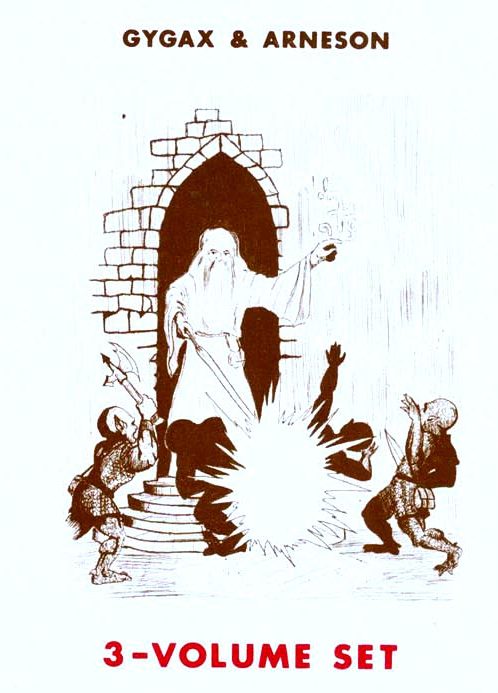
Most of the artwork form Original D&D would likely be considered too primitive by Hasbro’s current art department to be considered for reproduction as a stamp. Plus, some of it is derived from some comic-book traces, so reprinting it might reawaken a specter of copyright infringement that the legal teams might prefer to slumber peacefully. Nevertheless, for this exercise it seems like something from The Genesis is important for historical commemoration, so I propose the “Wizard Zapping Some Goblins” cover from one of the White Box printings. I’m really rather partial to the old OD&D art, since it really encapsulates the zinester enthusiasm of a small group of hobbyists creating for each other.
Holmes Basic Cover by David C. Sutherland III
Here it is: a dungeon and a dragon, and brave adventurers! This one may also be too primitive for Hasbro to proudly present, but I kind of like it. D&D has moved up in the world—this box features full color printing, even if the book inside has a monochrome blue version of this image on it. As an alternate, I also quite like Erol Otus’ cover of Moldvay Basic for a similar “facing the dragon” theme.
AD&D Player’s Handbook Cover by David A. Trampier
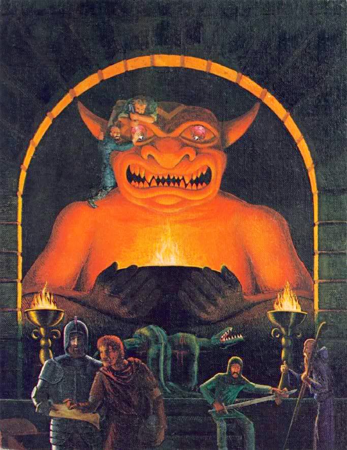
The cover of the AD&D Players Handbook just seems too huge and iconic to leave out. As a commentator at Grognardia mentioned, perhaps the slain lizard folk are a bit too graphic for the USPS, but a cropped version featuring the idol itself and the adventurers attempting to acquire its gem eyes would certainly be sufficient.
Unearthed Arcana Cover by Jeff Easley
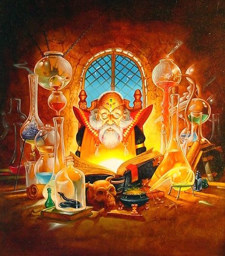
While there’s neither dungeon nor dragon here (unless that’s a tiny serpentine dragon in one of those jars), this scholar/wizard/alchemist at work perfectly encapsulates the power of a book to unlock a magical world, and is a nice representation one of the principal D&D experiences for millions of gamers: perusing the tomes.
Cover of Dragon #126 by Daniel R. Horne
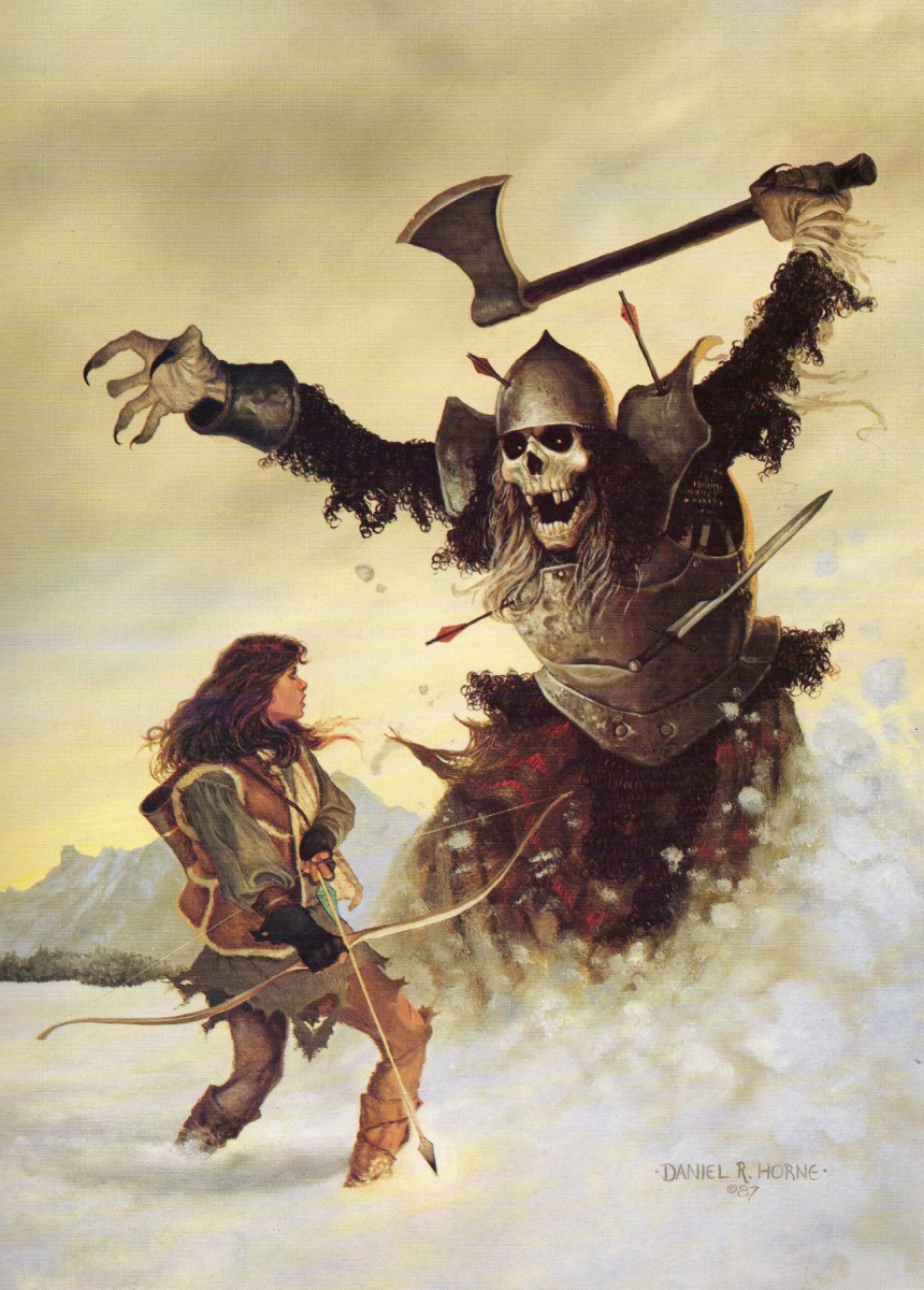
I mean, this one practically speaks for itself. I could try to cook up some analysis of the dynamism of the composition, or the menace of the skeleton (a giant skeleton, no less?) in contrast to the brave adventurer, but just look at it! STAMPWORTHY.
A Beholder
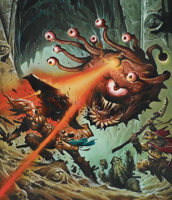
So… whoever went through all of D&D’s artwork sat down and picked that Purple Worm for a stamp? Sure, it’s a technically proficient Purple Worm illustration, and I like Purple Worms as much as anyone, but you guys have Beholders. You have so many Beholders! Yes, the Dragon is in the name of the game, and has the power of cultural iconography and weight of mythos behind it, but a Beholder is Brand Identity! Legally speaking, nothing says “D&D” more than a beholder, because everything else is literally or figuratively public domain!
Ardent by William O’Connor
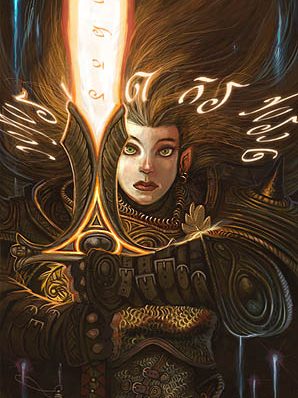
The much maligned Fourth Edition was my “return edition” that I started playing after college when I had a grown-up job and had settled into a routine of paying taxes and buying my own groceries, so it still holds a special place in my heart. I had a lot of fun with it, despite how general internet opinion has branded it “a failure,” and I’ll bet I’d still have fun with it today if I was at a table running it. In terms of art, Wayne Reynolds tended to be the primary cover artist for that edition, but I found myself most drawn to the art of William O’Connor when it came to the interior art. This one from third Player’s Handbook 3 always struck me as pretty cool, and I love the interplay of light and texture, and I think it would translate well to a stamp. The cover image of the Arcane Power supplement would be pretty good too, if the USPS isn’t worried about Satanic Panic blowback about a tiefling sorcerer.
Mr. O’Connor is also an artist we’ve recently lost, who passed away unexpectedly back in 2018, so having some of his work memorialized in a stamp would be a nice tribute for one of the principal artists of Fourth Edition.
Cover of Eberron Player’s Guide by Wayne Reynolds
We can’t really overlook Wayne Reynolds though, right? I love the detail work on his figures, even if they can delve into the realm of “too busy” (e.g., Leifeld pouches), and I’m willing to forgive the occasional Oversize Anime Sword. Paizo was very clever to manage to snag Mr. Reynolds away from flagship D&D to become the artist associated most closely with Pathfinder. The depiction of the Lord of Blades on the 4e Eberron Campaign Guide is among my favorites, but it might be a little too “Michael Bay Megatron” to read as “D&D” to the average stamp purchaser, so let’s go with the companion piece on the Eberron Player’s Guide. This one is a bit sentimental for me personally too, since my first “return campaign” as a player was in a 4e Eberron game.
Larry Elmore
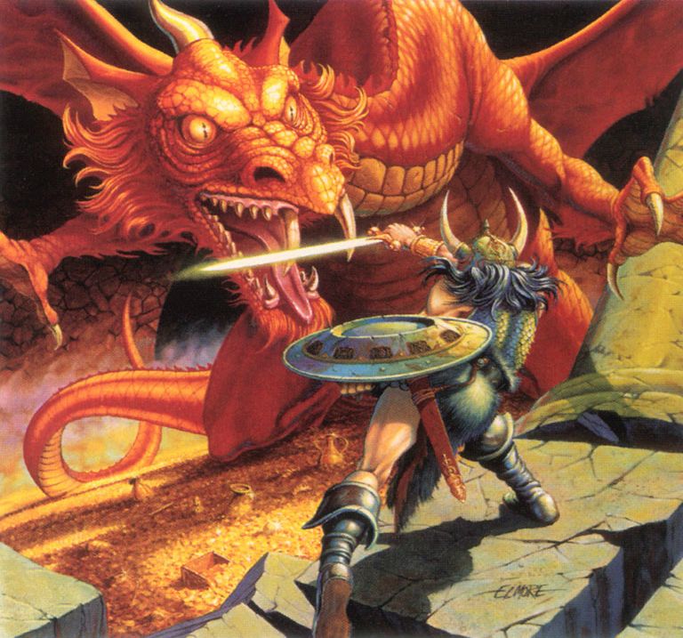
And, of course, we should really keep that Larry Elmore stamp too. Maybe we could go ahead and drop the Whitebox Wizard and keep a uniform, full-color look to all of the stamps. Although I like this painting, I confess that the image doesn’t quite give me the same electric charge as it might to gamers a little older than I am. But, like the Trampier PHB cover above, it’s simply too iconic to overlook. If you want a more in-depth, cracking analysis of Mr. Elmore’s work, check out this video by the always entertaining Bard.
Anyway, that’s my two cents about what I would’ve stuck on those stamps, after giving it a very few hours of thought as a completely unqualified arm-chair art director. Your mileage may vary—the second edition of AD&D is kind of my overlooked edition, so if you have a more personal relationship with 2e, perhaps you would prefer more Elmore, or some of that rad Tony DiTerlizzi Planescape work! Let me know if there are any particular illustrations you’d have selected for inclusion. I’m not sure I mentioned anything from Third Edition either, now that I think of it…
- Most of the images showcased here have been shamelessly discovered through some quick image searches on the web, and presented with credit to artists when possible, but not necessarily to where I found the source JPEG. I suspect the use of such images is within the realm of the Fair Use doctrine given the limited discussion/art criticism purpose of this post, but please let me know if you object to a reproduction, and I’ll discretely delete the image. ↩︎
Are there copyright issues with Trampier’s illustrations? He’s obviously by far the best D&D artist for stamps. He’s dead, I’ve been playing D&D a long time and I’m pretty sure that means we get to take his stuff.
There’s certainly copyright protection for Trampier’s work, and for the artwork of everyone else who has ever illustrated a D&D project. Of course, whether the artist hold the copyright or the company does (on a “work-for-hire” basis) is a more open question. Based on how frequently WotC/Hasbro has reproduced the images (or made “derivative works” like the special edition AD&D books from about 10 years ago) any issues have probably been long cleared up, and my hunch is that since Trampier was an employee of TSR when the work was made, the copyright is probably held by TSR and its successor company WotC/Hasbro. So, it certainly seems reasonable that some “classic” artwork could easily be provided for the stamps, in the same way it was available for the recent Art & Arcana book.
But even if Trampier’s famous Player’s Handbook work won’t technically be in the legal public domain for decades (until 2073, I think!), it’s certainly in the “spiritual” folklore public domain, since that demon statue gets referenced and riffed a lot, and I suspect not every use and derivative work is cleared through Hasbro legal!